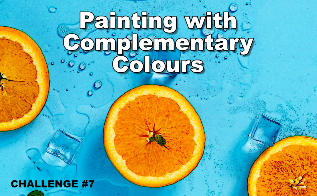
Challenge Tutorial
Welcome to the 7th art challenge where I teach you a basic art concept and then challenge you to create a painting using your new knowledge.
In today’s challenge we will be looking at painting with complementary colours.
You will learn what they are and how you can use them to give your paintings extra zing.
What Are Complementary Colours
So let’s start off with a little theory by looking at the colour wheel to see what complementary colours are.

Here we have a colour wheel showing the primaries, secondaries as well as the tertiaries.
If you don’t know how the colour wheel works yet, you would want to follow that tutorial first. I will link to it in the description below.
Complementary colours are colours that are opposite each other on the colour wheel.
Examples of complementaries are red and green, orange and blue, as well as yellow and purple.
Complementary colours interact with each other in interesting ways which allows us to get some great effects on the canvas.
Definition of a Complementary Colours
Complementary colours are colours opposite each other on the colour wheel. When mixed together they cancel each other out. They make each other look more vibrant when painted side by side.
Mixing Complementary Colours Together
The first of these is that they tone each other down when mixed together.
We then use complimentaries as part of our colour mixing rules to mix shadow colours.
For example if you need the shadow colour of red, you add green to the red.
By the same token, if you need to shadow green, you add red to it.
In other words, to reduce the vibrancy of a colour, you add it’s complement.
Complementary Colours Side by Side
Quite interestingly though when you paint complimentary colours next to each other they make each other look more vibrant. Quiet weird eh?
We won’t go into the technical details of why this happens today. As long as we know it happens then we can use this effect in our paintings.
Here are three examples so you can see the effect for yourself

The colours seem to zing don’t they? Almost to the point where they hurt your eyes.
Nature knows this so you will often find amazing examples if you look around you.
You may even have inadvertently created paintings already that are based off complementary colours without realising it. At the time all you knew was that the colours seem to work well together.
I think you will agree that creating an artwork using complimentaries like this will give you fantastic results and the painting will really pop.
Sometimes though we don’t always want our paintings to be as vibrant and in your face. At other times we want a more subtle painting yet still want that zing effect that using complementaries give us.
There are four ways to do this:
Painting with Complementary Colours
1) Toning Down

You tone down one of the complementary colours so that it is not as vibrant. This more subtle colour is then used in the background. It’s complement is however kept vibrant around the focal point.
Your eye is then drawn to the vibrant colour which still gets the added zing from being next to it’s complement.
2) Split Complementaries

The next way is to use split complimentaries.
Using pure complimentaries in a painting doesn’t give you much colour variation to work with. You are only able to use different tonal values of the two compliments.
With the split complementary colour scheme you choose what your accent colour is going to be.
For example if you choose blue as your accent then normally you would use orange as the complement. Using split complementaries you would use the two colours on either side of the complimentary. In our blue example you would use mustard
3) Harmonious Complementaries

The third way is one of my favourites and I call it harmonious complementaries. With this colour scheme you use the complementary colour as well as the split complementary colours.
As these three colours lie next to each other on the colour wheel we now have a harmonious range of colours with which to work. This then gives the painting an overall calm effect. The complementary is then introduced which brings the
entire painting to life.
Usually you would use this complimentary accent colour in the focal point but it isn’t required. You will still get the vibrancy effect even if the compliment isn’t in the focal point as long as the complementary colours are next to each other.
4) Complimentary Underpainting

The fourth way is very popular with many artists.
With this method you add a wash over the canvas using the complementary colour before you start painting in order to tone the canvas.

For example you would add a thin orange wash over the sky area of the canvas. Once this is dry you then paint the sky as normal.
The theory is that any exposed canvas or transparent areas after the sky has been painted will be the complementary colour, making the blue in the sky appear more vibrant.
The same can be done with the land area by using reds.

You will often see artist using burnt sienna as a complimentary underpainting over the entire canvas when painting landscapes.
The burnt sienna is orange enough to act as a compliment for the blue sky and red enough to act as a compliment to the green foliage.
Real Life Complementary Colour Examples
Let’s take a look at a few pictures so we can see how complementaries have improved the scene.

Look at how dramatic this sunset looks because of the complementary colours despite the fact that the colours are not very intense.

Here is a classic example of how red and green play off of each other in nature.

And just look at how beautiful the bee and the flower colours play off each other in this photo.
Old Masters Used Complementary Colours

Van Gogh loved to use complementary colours in his paintings. He used them in Starry Night, Cafe Terrace, numerous sunflower paintings and in The Night Cafe among others.
You can see how these artworks are all extremely bold even to the point of screaming at you as a result.

He was not the only famous painter to make use of complementary though.
Here you can see how Vermeer has used harmonious complimentaries in the jug, bowl, blouse, dress and even the bread and floor to create a harmonious effect in the painting. He then added three areas of blue surrounding the focal point, which is the milk that is being poured, in order to get a vibrant effect in that area.

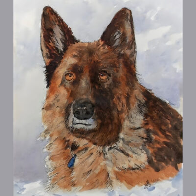
In this painting I have kept the background harmonious and muted. The red brown of the deer however is a lot more vibrant making him jump out at you when you look at the painting.

In this painting all the colours in the lady are harmonious, then the complementary has been added to the background and eyes to make the entire painting look vibrant.

The same happens here where the green juxtaposes with the harmonious yellows, mustards and reds.
Now I want to show you how I have taken existing paintings and modified them in order to add the complementary colour into them so that you can see what a big difference it can make to an artwork.
Adding Complementary Colours into Your Paintings

Here is a painting I did for the Slice of Orange art lesson.
As you can see the background was kept a little pink in order to create a harmonious effect in the final painting. Now let’s replace that background with blue, which is the complementary of orange to see what the painting would look like.

Wow that changes the whole look and feel of the painting doesn’t it?
The painting has gone from a clam peaceful one to a bright and vibrant one that just shouts SUMMER!
The next painting is a typical seascape scene which you can follow in the Boat on the Beach class.

As you can see there are many blues as well as greens making the majority colour a turquoise blue.
Then there is a yellow boat which is not the complementary colour so it would look good if it was the complementary colour. Let’s modify the boat and see what it looks like:

Again we have a pretty dramatic change to the painting.
The boat is now really the front and center focal point it stands out so much due to the addeed deep orange.
To further play up the zing effect that the complementaries add to the painting I have also added a touch of yellow to white and repainted the birds so they stand out more.
I have also added a touch of orange to white and repainted the clouds. You can see how much more vibrant they look as a result as well.
So I hope you can now see how valuable using complementary colours in your paintings can be and will use it going forward.
Now it’s time for me to lay down your challenge.
Your Challenge
Your challenge is to create an artwork that contains the complementary colours.
You can use either complementary colours themselves, or split complementaries or even harmonious complementaries.
Choose any subject and medium you like.
Are you up for the challenge?
I know you are!
You have until the 30st of August 2019 to post your challenge on the forum. You can click the button below to go to the correct place on the forum.
Everybody will then vote during the first week of September to decide who created the best pattern artwork.
Good luck I looke forward to seeing your creation.
Tip
If you are not a member yet, you can join for free by signing up to our mailing list below.
You will then get a coupon code to unlock any class on the site for free as well as get lifetime access to the forum and the challenges.